Customer Segmentation Analysis
Using K-Means clustering to identify distinct customer groups and optimize marketing strategies.
🗂️ About the Dataset
The dataset titled "Shop Customer Data" contains 2,000 records and provides insights into an imaginary shop’s customer base. It includes key features such as Age, Annual Income, and Spending Score, which were utilized for this segmentation analysis.
Optimal Clusters
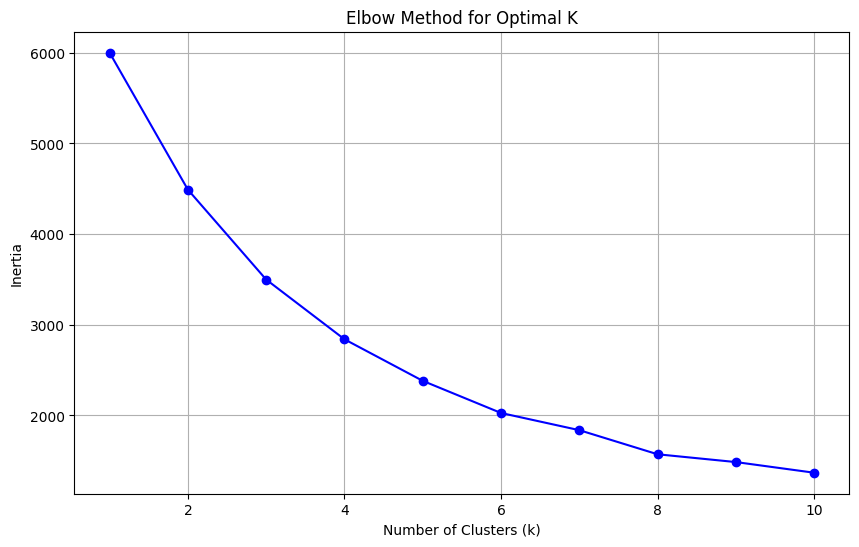
The Elbow Method is used to determine the ideal number of clusters (k). The "elbow" point at k = 5 indicates the optimal balance between cluster compactness and computational efficiency.
View Python Code
from sklearn.cluster import KMeans
from sklearn.preprocessing import StandardScaler
import matplotlib.pyplot as plt

scaler = StandardScaler()
data_scaled = scaler.fit_transform(customers_data[['Age', 'Annual Income ($)', 'Spending Score (1-100)']])

inertia = []
k_values = range(1, 11)
for k in k_values:
    kmeans = KMeans(n_clusters=k, random_state=42)
    kmeans.fit(data_scaled)
    inertia.append(kmeans.inertia_)

plt.figure(figsize=(10, 6))
plt.plot(k_values, inertia, marker='o', color='b')
plt.title('Elbow Method for Optimal K')
plt.xlabel('Number of Clusters (k)')
plt.ylabel('Inertia')
plt.grid()
plt.show()
Cluster Visualization
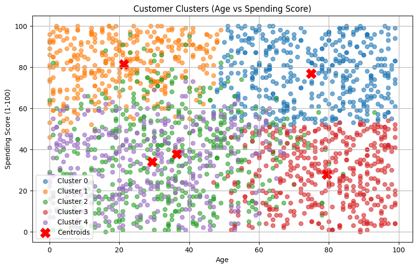
This scatter plot visualizes the 5 distinct customer segments based on Age and Spending Score. The red 'X' markers represent the centroids of each cluster.
View Python Code
from sklearn.cluster import KMeans

kmeans = KMeans(n_clusters=5, random_state=42)
clusters = kmeans.fit_predict(data_scaled)

customers_data['Cluster'] = clusters

plt.figure(figsize=(10, 6))
for cluster in range(5):
    cluster_points = data_scaled[clusters == cluster]
    plt.scatter(cluster_points[:, 0], cluster_points[:, 2], label=f'Cluster {cluster}', alpha=0.6)
plt.scatter(kmeans.cluster_centers_[:, 0], kmeans.cluster_centers_[:, 2], color='red', marker='X', s=200, label='Centroids')
plt.title('Customer Clusters: Age vs Spending Score')
plt.xlabel('Age (Standardized)')
plt.ylabel('Spending Score (Standardized)')
plt.legend()
plt.grid()
plt.show()
Attribute Distribution by Cluster
The following boxplots show how Age, Annual Income, and Spending Score vary across the different customer segments, providing a deeper understanding of each group's characteristics.
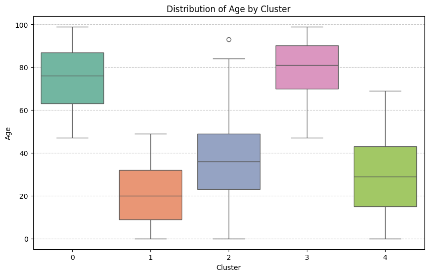
Age Distribution
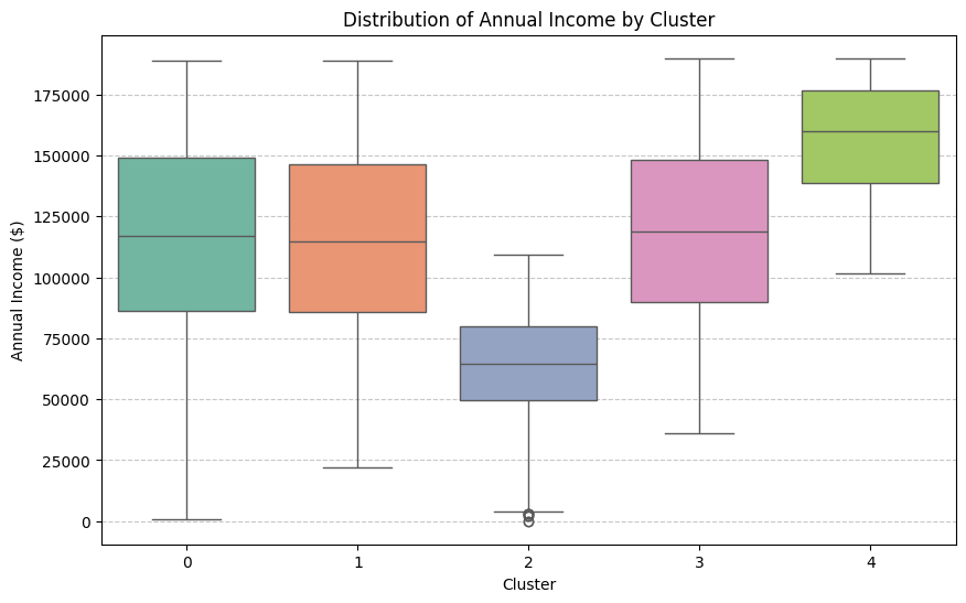
Income Distribution
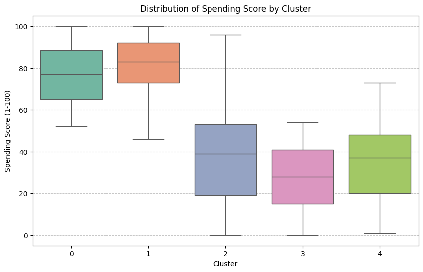
Spending Score Distribution